Reference
Page Designer Block Library
The Page Designer, opened from the event's Designer tab, builds the public event website from blocks. A page is a stack of sections; each section holds columns; each column holds blocks. Only the Tabs block nests further (it holds blocks inside each tab). Turn on the Tabs block's Deep link setting so a link to the page can open a specific tab. The Register Button block has a Sticky on mobile setting that pins it to the bottom of the screen on phones. Most event blocks read live Salesforce data, so adding a speaker or session updates the page without re-building it.
The canvas and the live page use the same renderer, so what you see while designing is what visitors get (apart from the editor overlays). Legacy page styles (Tabbed, Dynamic, Simple, and others) are set with the event's UI Experience and the Public Event Page settings; those settings do not affect Page Designer pages.
How designs are saved and made live
- There is no separate Publish step. Saving writes the design in place, and assigning the design to the event is what makes it the event's page. Autosave starts after your first explicit Save (about five seconds after a change), also writes to the live design, and stops silently after three failed retries, so save explicitly before you leave and keep a copy of anything you are experimenting with.
- A design can be shared by several events. When you save a shared design, Forge asks whether to save for all events, make a copy just for this event, or start from a template.
- Version history is only the undo list for the current tab (up to 30 steps, lost when you close the tab). There is no author log or rollback after that.
- Page data caches for about ten minutes, so a Salesforce-side change to a related record may take a few minutes to show on the public page.
Because autosave writes straight to the live design and there is no draft, build major redesigns on a copy (Save as template or a separate design) and assign it when ready.
Page structure
| Level | What it is | Recommendation |
|---|---|---|
| Section | A full-width row. Controls background, spacing, and responsive overrides. A section that holds a Header must be first and one that holds a Footer must be last. | Use one section per visual band of the page, such as hero, schedule, speakers. |
| Column | A vertical slice of a section with a width percentage. Columns stack into one column on tablet and mobile; this cannot be turned off per section. | Use two or three columns for desktop, and check the mobile preview. |
| Block | A single element in a column. | Prefer the event data blocks over copying text, so the page stays current. |
Header and footer blocks
| Block | What it shows | Data | Notes and recommendation |
|---|---|---|---|
| Header | Top navigation with the event name, links, a cart or register link, and the public language selector. | Event cart or checkout URL | Locked to the first section. Do not remove it unless you are embedding the page. |
| Footer | Closing links and the organization logo, in link columns. | Authored text and org logo | Locked to the last section. |
Event data blocks
These read live event data. They show nothing, or a placeholder, when the underlying record is empty.
| Block | What it shows | Data | Notes and recommendation |
|---|---|---|---|
| Event Title | The event name. | Event name | Follows the theme background until you change the background color. |
| Event Banner | The event's banner image with a status label (Completed, Sold Out, Upcoming, Closed). | Event banner image | Shows a placeholder until you set a banner image on the event. |
| About Event | The event description. | Event description | Renders nothing if the description is empty. Fill it in on Event Details first. |
| Event Date & Time | Start, end, timezone, and sessions grouped by day. | Event dates and sessions | Handles multi-day events and events that end after midnight. Make sure the event's timezone is correct. |
| Event Countdown | A live countdown to the event start. | Event start | Has a hide-after-start option; turn it on so the page does not show a finished countdown. |
| Sessions Schedule | The agenda by day and track. | Sessions and tracks | Times render in the event's timezone. Sessions without a start date are silently left out, so check every session has one. |
| Speakers | Speaker cards with photo, name, title, and company. | Speakers marked Shown on Listing | Only speakers whose visibility allows listing appear. A speaker with no photo, or a photo that fails to load, shows their initials instead. |
| Sponsors | Sponsor logos or names. | Confirmed sponsors with an image or a name | Only Confirmed sponsors appear. A sponsor with no image shows its name as text. |
| Ticket Pricing | The event's ticket types and prices. | Tickets | Use for a full price table. |
| Simple Pricing Card | A compact card with the starting ticket price. | Tickets | Use for a small teaser near a Register Button. |
| Simple Location Card | The venue with Open Map, Directions, and Website buttons. | Venue | Fill in the venue on Event Details so the map link works. |
| FAQ | An accordion of questions and answers. | Event FAQ | Categories with no questions are hidden. |
| Info Cards | Up to four cards with counts such as speakers, sessions, sponsors, attendees, and tickets. | Event and related records | Counts always show a plus sign, for example 5+. Choosing a card type overwrites the card's icon, title, and text. |
| Register Button | A button to register or buy. | Event cart | There is no URL field; the destination is chosen for you. With the sticky setting on, it stays pinned to the bottom of the screen on phones. |
| Simple Checkout - Modern Design | A complete checkout (tickets, questions, cart) inside the page. | Tickets, form questions, cart | Supports free tickets only. A paid event shows an unsupported message, so use Register Button for paid events. |
| Contact Us | A contact form on the public page; the event name becomes the subject. | Event name | The only block that posts from a public page. Its labels can be translated. |
| Umbrella events | The published events of an umbrella (event group), each linking to its own event page. | Child events of the umbrella; 20 shown, then Show More. Each shows Available, Limited (90% full or more), Waitlist or Sold out, and bundle cards list the events they include. When a cart is one item short of a bundle, the order summary shows a hint with the savings; totals are not changed. | Place on the umbrella's public page (/g/<slug>). Choose Event order: date or name. An umbrella with no published events shows a short empty message. |
| Umbrella breadcrumb | A Part of <umbrella> link from a child event to its umbrella page. | The event's parent umbrella | Add to the event page layout so visitors can move up to the umbrella. |
| Event Organizer | The organizer's name. | Event organizer name | Renders nothing if the organizer name is empty. Fill it in on Event Details first. |
| Add to Calendar | Links that add the event to Google Calendar, Outlook, Yahoo or an .ics file. | Event name and start and end time | Renders nothing until the feature is on for your organization or if the event has no start time. |
Content blocks
These hold text, images, and media you type or upload.
| Block | What it shows | Data | Notes and recommendation |
|---|---|---|---|
| Hero | A banner with heading, subtext, an image, and up to two buttons. | Authored plus event | When both buttons are shown they are centered side by side, whatever the text alignment. |
| Title, Text, Paragraph | Headings and body text. | Authored | Title and Text share one settings panel. Use Paragraph for body copy. |
| Rich Text | Formatted text with links and lists. | Authored | Not machine-translated, so translate it by hand if you serve several languages. |
| Button | A button with a label and link. | Authored | Always set a label; an empty button is flagged by the accessibility check. |
| Image | A single image with alt text and optional 3D tilt on hover. | Authored or asset library | Always add alt text. The tilt effect is turned off for visitors who prefer reduced motion. |
| Video | An embedded video, normally a YouTube link. | Authored | Paste a normal YouTube URL; it is converted for embedding. |
| Icon, Icon Box, Icon List | An icon, an icon with heading and text, or a list of icon lines. | Authored | Use for feature highlights and short lists. |
| Social Share Button | A button to share the page. | Authored | Use for public events. |
| Tabs | A container with several tabs, each holding its own blocks. | Authored plus child blocks | The only block that nests other blocks. Keep each tab focused. |
Styling and theme
| Area | What you can set | Recommendation |
|---|---|---|
| Site settings: Colors | The page color scheme (about 55 color values, including the base theme colors). | Choose a theme first. Changing the theme re-colors the whole existing design, including section and block colors. |
| Site settings: Typography | Fonts and six named size styles: heading 1, heading 2, heading 3, body large, body small, and caption, each with a weight. | Use the named sizes rather than custom sizes so a change in Site Settings updates every block. |
| Site settings: Stylings | Borders, radii, and similar details. | Leave at defaults unless you have a style guide. |
| Site settings: Custom CSS | One block of CSS injected into the page. | Use for small fixes only. Test on mobile. |
| Site settings: Embed | A copy-paste iframe snippet generator for putting the event page on another site, with Full, Fixed, or Auto height and an optional loader. | Use Auto height when embedding so the page grows with its content. |
| Section and column styles | Background color or image, overlay, padding and margin, with per-device spacing overrides and per-device backgrounds for sections. | Set desktop first. On tablet spacing scales to about 70 percent and on mobile to about 50 percent unless you override it. |
| Responsive breakpoints | Desktop 1024 px and wider, tablet 768 to 1023, mobile under 768. | Check all three previews. There is no per-block hide on mobile. |
Editor tools
Selecting, Moving and Navigating Blocks
- Hover or select a block to reveal its labelled drag tab, then drag it to reorder. A line shows exactly where it will land.
- The path bar above the canvas (Page, Section, Column, Block) selects any parent in one click.
- Press Esc to step the selection up one level: block, then column, then section, then none.
- The move up, move down and select-parent buttons on a selected block are disabled at the edge of a container and next to the pinned header and footer.
The Left Rail: Add, Structure and Layouts
- Add lists every block you can insert on this kind of page.
- Structure shows the whole page as a searchable tree. Click a row to select it, and use the move buttons to reorder.
- Layouts inserts a ready-made section with columns after the selected section in one click. Undo removes it in a single step.
Templates, History and Help
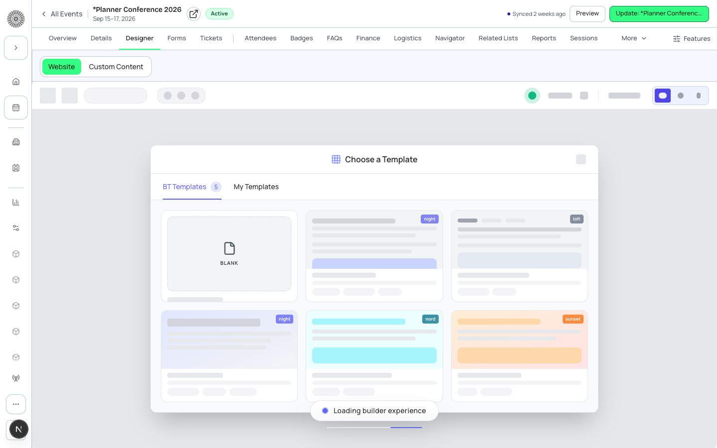
- The template gallery opens automatically on an empty page and offers starting points for your page kind. Applying a template is a single undo step.
- The History menu lists your recent edits. Choose one to jump back or forward to that point.
- The Help menu restarts the guided tour, lists keyboard shortcuts and links to this guide.
- The Tour button in the toolbar replays the 11-step builder tour at any time. Each step highlights the control it describes (palette, canvas, inspector, device preview, language, site settings, X-ray, undo, fullscreen, save as template, forms). Press Esc to leave the tour.
Forms, Checkout and Emails Surfaces
The surface switcher in the toolbar changes what you are designing. Forms embeds the form builder with conditional logic and per-question translation. Checkout shows the checkout flow. Emails and Journey lays out the emails sent at each step of a registrant's journey.
Emails are drafts
Creating an email from the Page Designer only saves a draft. Nothing is sent to anyone until you send or schedule it from Communications.